biokinetics case study
biokinetics.RmdThe underlying biokinetics model was developed in the
following paper: Russell TW et
al. Real-time estimation of immunological responses against emerging
SARS-CoV-2 variants in the UK: a mathematical modelling study. Lancet
Infect Dis. 2024 Sep 11:S1473-3099(24)00484-5
This vignette demonstrates how to use the epikinetics
package to replicate some of the key paper figures.
Fitting the model
To initialise a model object, the only required argument is a path to the data in CSV format, or a data.table. See biokinetics for all available arguments. In this vignette we use a dataset representing the Delta wave which is installed with this package, specifying a regression model that just looks at the effect of infection history.
The fit method then has the same function signature as
the underlying cmdstanr::sample
method. Here we specify a relatively small number of iterations of the
algorithm to limit the time it takes to compile this vignette.
dat <- data.table::fread(system.file("delta_full.rds", package = "epikinetics"))
mod <- epikinetics::biokinetics$new(data = dat,
                                    lower_censoring_limit = 40,
                                    covariate_formula = ~0 + infection_history)
delta <- mod$fit(parallel_chains = 4,
                 iter_warmup = 50,
                 iter_sampling = 200,
                 threads_per_chain = 4)
Figure 2
Figure 2 from the paper shows population level fits for each wave, disaggregated by infection history and titre type. Here we reproduce the facets for the Delta wave. Once the model has been fitted, simulate population trajectories using the fitted population parameters.
res <- mod$simulate_population_trajectories()
#> INFO [2025-06-17 14:51:05] Summarising fits
#> INFO [2025-06-17 14:51:08] Adjusting by regression coefficients
#> INFO [2025-06-17 14:51:10] Summarising into quantiles
head(res)
#>    time_since_last_exp       me        lo       hi titre_type infection_history
#>                  <int>    <num>     <num>    <num>     <char>            <char>
#> 1:                   0 112.8460  88.59188 143.0309  Ancestral   Infection naive
#> 2:                   1 143.0190 115.66984 177.9631  Ancestral   Infection naive
#> 3:                   2 181.7228 149.73768 219.3123  Ancestral   Infection naive
#> 4:                   3 229.5554 191.88651 274.0090  Ancestral   Infection naive
#> 5:                   4 290.3409 243.29860 348.8412  Ancestral   Infection naive
#> 6:                   5 365.8364 306.09625 452.1910  Ancestral   Infection naive
See data for the definition of the returned columns.
Using ggplot2:
library(ggplot2)
custom_theme <- theme_linedraw() + theme(
    legend.position = "bottom",
    text = element_text(size = 8, family = "Helvetica"),
    strip.text.x.top = element_text(size = 8, family = "Helvetica"),
    strip.text.x = element_text(size = 8, family = "Helvetica"),
    strip.background = element_rect(fill = "white"),
    strip.text = element_text(colour = 'black'),
    strip.placement = "outside",
    legend.box = "vertical",
    legend.margin = margin(),
)

custom_palette <- c("#CC6677", "#DDCC77", "#88CCEE")

plot_data <- res
plot_data[, titre_type := forcats::fct_relevel(
  titre_type,
  c("Ancestral", "Alpha", "Delta"))]

ggplot(data = plot_data) +
  geom_line(aes(x = time_since_last_exp,
                y = me,
                colour = titre_type)) +
  geom_ribbon(aes(x = time_since_last_exp,
                  ymin = lo,
                  ymax = hi,
                  fill = titre_type), alpha = 0.65) +
  scale_y_continuous(
    trans = "log2",
    breaks = c(40, 80, 160, 320, 640, 1280,
               2560, 5120),
    labels = c("40", "80", "160", "320", "640", "1280", "2560", "5120"),
    limits = c(40, 10240)) +
  scale_x_continuous(breaks = c(0, 30, 60, 90, 120),
                     labels = c("0", "30", "60", "90", "120"),
                     expand = c(0, 0)) +
  coord_cartesian(clip = "off") +
  labs(x = "Time since last exposure (days)",
       y = expression(paste("Titre (IC"[50], ")"))) +
  facet_wrap(infection_history ~ titre_type) +
  scale_colour_manual(values = custom_palette) +
  scale_fill_manual(values = custom_palette) +
  guides(colour = "none", fill = "none") +
  custom_theme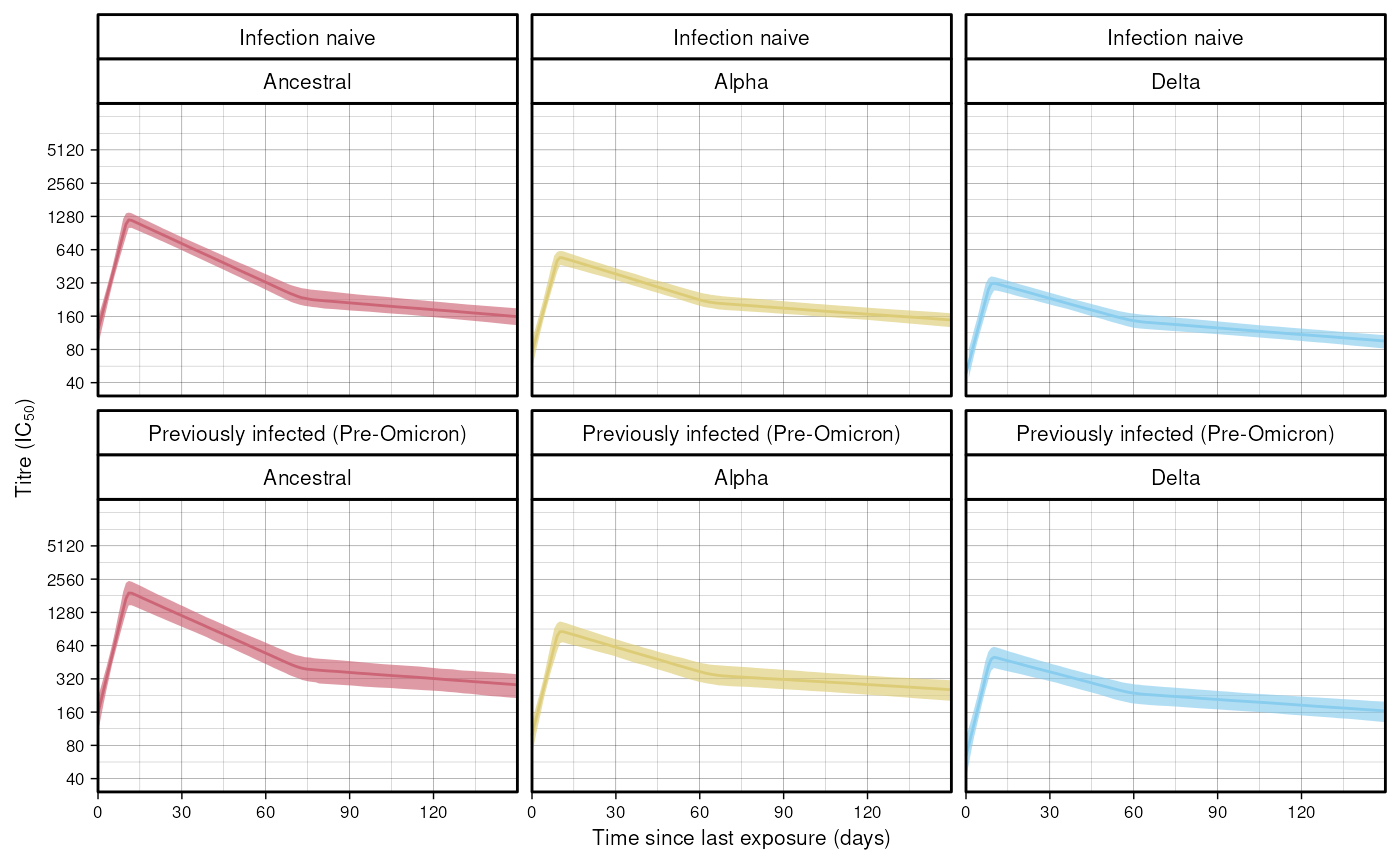
Figure 4
Figure 4 shows the relationship between infection history and titre values at peak and set points, for different titre types. We first simulate estimates for these from the fitted model:
res <- mod$population_stationary_points(n_draws = 2000)
#> INFO [2025-06-17 14:51:12] Extracting parameters
#> INFO [2025-06-17 14:51:12] Adjusting by covariates
#> INFO [2025-06-17 14:51:12] Calculating peak and switch titre values
#> INFO [2025-06-17 14:51:12] Recovering covariate names
#> INFO [2025-06-17 14:51:12] Calculating medians
head(res)
#>    infection_history titre_type     mu_p     mu_s rel_drop_me mu_p_me mu_s_me
#>               <char>     <char>    <num>    <num>       <num>   <num>   <num>
#> 1:   Infection naive  Ancestral 1168.928 225.6553   0.1893087 1233.49 234.331
#> 2:   Infection naive  Ancestral 1237.139 262.1662   0.1893087 1233.49 234.331
#> 3:   Infection naive  Ancestral 1275.875 243.4242   0.1893087 1233.49 234.331
#> 4:   Infection naive  Ancestral 1311.227 259.0683   0.1893087 1233.49 234.331
#> 5:   Infection naive  Ancestral 1295.196 206.9455   0.1893087 1233.49 234.331
#> 6:   Infection naive  Ancestral 1299.692 247.3273   0.1893087 1233.49 234.331
The values we’re going to plot are the mean peak titre values
(mu_p) and mean set point titre values (mu_s),
for different titre types and infection histories. See data for a full definition of all the returned
columns. Using ggplot2:
plot_data <- res[, titre_type := forcats::fct_relevel(
  titre_type,
  c("Ancestral", "Alpha", "Delta"))]

ggplot(data = plot_data, aes(
  x = mu_p, y = mu_s,
  colour = titre_type)) +
  geom_density_2d(
    aes(
      group = interaction(
        infection_history,
        titre_type))) +
  geom_point(data = plot_data,
             alpha = 0.05, size = 0.2) +
  geom_point(aes(x = mu_p_me, y = mu_s_me,
                 shape = infection_history),
             colour = "black") +
  geom_path(aes(x = mu_p_me, y = mu_s_me,
                group = titre_type),
            colour = "black") +
  geom_vline(xintercept = 2560, linetype = "twodash", colour = "gray30") +
  scale_x_continuous(
    trans = "log2",
    breaks = c(40, 80, 160, 320, 640, 1280, 2560, 5120, 10240),
    labels = c(expression(" " <= 40),
               "80", "160", "320", "640", "1280", "2560", "5120", "10240"),
    limits = c(NA, 10240)) +
  geom_hline(yintercept = 2560, linetype = "twodash", colour = "gray30") +
  scale_y_continuous(
    trans = "log2",
    breaks = c(40, 80, 160, 320, 640, 1280, 2560, 5120, 10240),
    labels = c(expression(" " <= 40),
               "80", "160", "320", "640", "1280", "2560", "5120", "10240"),
    limits = c(NA, 5120)) +
  custom_theme +
  scale_shape_manual(values = c(1, 2, 3)) +
  labs(x = expression(paste("Population-level titre value at peak (IC"[50], ")")),
       y = expression(paste("Population-level titre value at set-point (IC"[50], ")"))) +
  scale_colour_manual(values = custom_palette) +
  guides(colour = guide_legend(title = "Titre type", override.aes = list(alpha = 1, size = 1)),
         shape = guide_legend(title = "Infection history"))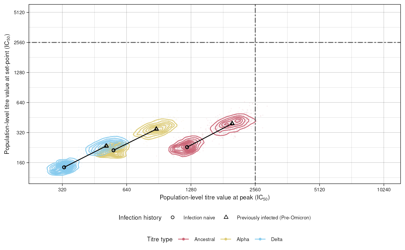
Figure 5
Figure 5 uses simulations of individual trajectories to derive population level titre values. This can take a while so here we set the maximum number of draws to just 250 for speed.
res <- mod$simulate_individual_trajectories(n_draws = 250)
#> INFO [2025-06-17 14:51:13] Extracting parameters
#> INFO [2025-06-17 14:51:17] Simulating individual trajectories
#> INFO [2025-06-17 14:51:21] Recovering covariate names
#> INFO [2025-06-17 14:51:21] Calculating exposure days. Adjusting exposures by 0 days
#> INFO [2025-06-17 14:51:24] Resampling
#> Registered S3 method overwritten by 'mosaic':
#>   method                           from
#>   fortify.SpatialPolygonsDataFrame ggplot2
#> INFO [2025-06-17 14:51:33] Summarising into population quantiles
head(res)
#>    calendar_day titre_type       me       lo       hi time_shift
#>          <IDat>     <char>    <num>    <num>    <num>      <num>
#> 1:   2021-03-08  Ancestral 1185.991 890.1526 1534.772          0
#> 2:   2021-03-09  Ancestral 1128.211 887.7483 1444.668          0
#> 3:   2021-03-10  Ancestral 1190.466 942.7031 1514.890          0
#> 4:   2021-03-11  Ancestral 1165.086 888.5316 1481.972          0
#> 5:   2021-03-12  Ancestral 1160.733 879.8674 1452.659          0
#> 6:   2021-03-13  Ancestral 1183.584 926.5421 1498.611          0
See data for a definition of all the returned columns. Figure 5 A plots the derived population trajectories. Here we replicate a portion of the graph from the paper, from the minimum date in the dataset until the date at which the next variant emerged.
date_delta <- lubridate::ymd("2021-05-07")
date_ba2 <- lubridate::ymd("2022-01-24")

res$wave <- "Delta"
dat$wave <- "Delta"
plot_data <- merge(
  res, dat[, .(
    min_date = min(day), max_date = max(day)), by = wave])[
  , .SD[calendar_day >= min_date & calendar_day <= date_ba2], by = wave]

plot_data[, titre_type := forcats::fct_relevel(
  titre_type,
  c("Ancestral", "Alpha", "Delta"))]

ggplot() + geom_line(
  data = plot_data,
  aes(x = calendar_day,
      y = me,
      group = interaction(titre_type, wave),
      colour = titre_type),
  alpha = 0.2) +
  geom_ribbon(
    data = plot_data,
    aes(x = calendar_day,
        ymin = lo,
        ymax = hi,
        group = interaction(titre_type, wave)
    ),
    alpha = 0.2) +
  labs(title = "Population-level titre values",
       tag = "A",
       x = "Date",
       y = expression(paste("Titre (IC"[50], ")"))) +
  scale_colour_manual(
    values = custom_palette) +
  scale_fill_manual(
    values = custom_palette) +
  scale_x_date(
    date_labels = "%b %Y",
    limits = c(min(dat$day), date_ba2)) +
  geom_smooth(
    data = plot_data,
    aes(x = calendar_day,
        y = me,
        fill = titre_type,
        colour = titre_type,
        group = interaction(titre_type, wave)),
    alpha = 0.5, span = 0.2) +
  custom_theme +
  guides(colour = guide_legend(title = "Titre type"), fill = "none",)
#> `geom_smooth()` using method = 'loess' and formula = 'y ~ x'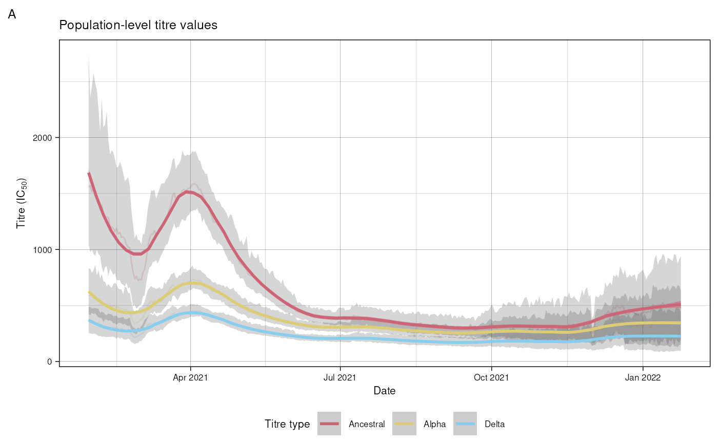
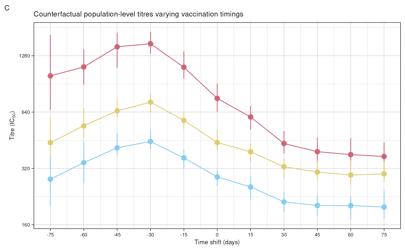
Figure 5 C shows counterfactual trajectories varying vaccination
timings. To do this, we simulate individual trajectories with different
time_shift arguments. Here we set the maximum number of
draws to just 50 for speed.
time_shift_values <- seq(-75, 75, by = 15)
indices <- seq_along(time_shift_values)

results_list <- lapply(indices, function(index) {
  shift <- time_shift_values[index]
  mod$simulate_individual_trajectories(n_draws = 50, time_shift = shift)
})
#> INFO [2025-06-17 14:51:35] Extracting parameters
#> INFO [2025-06-17 14:51:38] Simulating individual trajectories
#> INFO [2025-06-17 14:51:39] Recovering covariate names
#> INFO [2025-06-17 14:51:39] Calculating exposure days. Adjusting exposures by -75 days
#> INFO [2025-06-17 14:51:39] Resampling
#> INFO [2025-06-17 14:51:41] Summarising into population quantiles
#> INFO [2025-06-17 14:51:42] Extracting parameters
#> INFO [2025-06-17 14:51:45] Simulating individual trajectories
#> INFO [2025-06-17 14:51:46] Recovering covariate names
#> INFO [2025-06-17 14:51:46] Calculating exposure days. Adjusting exposures by -60 days
#> INFO [2025-06-17 14:51:46] Resampling
#> INFO [2025-06-17 14:51:48] Summarising into population quantiles
#> INFO [2025-06-17 14:51:49] Extracting parameters
#> INFO [2025-06-17 14:51:52] Simulating individual trajectories
#> INFO [2025-06-17 14:51:53] Recovering covariate names
#> INFO [2025-06-17 14:51:53] Calculating exposure days. Adjusting exposures by -45 days
#> INFO [2025-06-17 14:51:53] Resampling
#> INFO [2025-06-17 14:51:55] Summarising into population quantiles
#> INFO [2025-06-17 14:51:56] Extracting parameters
#> INFO [2025-06-17 14:51:59] Simulating individual trajectories
#> INFO [2025-06-17 14:52:00] Recovering covariate names
#> INFO [2025-06-17 14:52:00] Calculating exposure days. Adjusting exposures by -30 days
#> INFO [2025-06-17 14:52:01] Resampling
#> INFO [2025-06-17 14:52:02] Summarising into population quantiles
#> INFO [2025-06-17 14:52:03] Extracting parameters
#> INFO [2025-06-17 14:52:06] Simulating individual trajectories
#> INFO [2025-06-17 14:52:07] Recovering covariate names
#> INFO [2025-06-17 14:52:07] Calculating exposure days. Adjusting exposures by -15 days
#> INFO [2025-06-17 14:52:07] Resampling
#> INFO [2025-06-17 14:52:09] Summarising into population quantiles
#> INFO [2025-06-17 14:52:10] Extracting parameters
#> INFO [2025-06-17 14:52:13] Simulating individual trajectories
#> INFO [2025-06-17 14:52:13] Recovering covariate names
#> INFO [2025-06-17 14:52:13] Calculating exposure days. Adjusting exposures by 0 days
#> INFO [2025-06-17 14:52:14] Resampling
#> INFO [2025-06-17 14:52:16] Summarising into population quantiles
#> INFO [2025-06-17 14:52:16] Extracting parameters
#> INFO [2025-06-17 14:52:20] Simulating individual trajectories
#> INFO [2025-06-17 14:52:20] Recovering covariate names
#> INFO [2025-06-17 14:52:20] Calculating exposure days. Adjusting exposures by 15 days
#> INFO [2025-06-17 14:52:21] Resampling
#> INFO [2025-06-17 14:52:22] Summarising into population quantiles
#> INFO [2025-06-17 14:52:23] Extracting parameters
#> INFO [2025-06-17 14:52:26] Simulating individual trajectories
#> INFO [2025-06-17 14:52:27] Recovering covariate names
#> INFO [2025-06-17 14:52:27] Calculating exposure days. Adjusting exposures by 30 days
#> INFO [2025-06-17 14:52:27] Resampling
#> INFO [2025-06-17 14:52:29] Summarising into population quantiles
#> INFO [2025-06-17 14:52:30] Extracting parameters
#> INFO [2025-06-17 14:52:33] Simulating individual trajectories
#> INFO [2025-06-17 14:52:34] Recovering covariate names
#> INFO [2025-06-17 14:52:34] Calculating exposure days. Adjusting exposures by 45 days
#> INFO [2025-06-17 14:52:34] Resampling
#> INFO [2025-06-17 14:52:36] Summarising into population quantiles
#> INFO [2025-06-17 14:52:37] Extracting parameters
#> INFO [2025-06-17 14:52:40] Simulating individual trajectories
#> INFO [2025-06-17 14:52:40] Recovering covariate names
#> INFO [2025-06-17 14:52:40] Calculating exposure days. Adjusting exposures by 60 days
#> INFO [2025-06-17 14:52:41] Resampling
#> INFO [2025-06-17 14:52:43] Summarising into population quantiles
#> INFO [2025-06-17 14:52:43] Extracting parameters
#> INFO [2025-06-17 14:52:46] Simulating individual trajectories
#> INFO [2025-06-17 14:52:47] Recovering covariate names
#> INFO [2025-06-17 14:52:47] Calculating exposure days. Adjusting exposures by 75 days
#> INFO [2025-06-17 14:52:48] Resampling
#> INFO [2025-06-17 14:52:49] Summarising into population quantiles

combined_data <- data.table::data.table(data.table::rbindlist(results_list))
Plotting the median values:
plot_data <- combined_data[calendar_day == date_delta]
plot_data <- plot_data[, titre_type := forcats::fct_relevel(
    titre_type,
    c("Ancestral", "Alpha", "Delta"))]

ggplot(
  data = plot_data) +
  geom_line(aes(
    x = time_shift, y = me, colour = titre_type)) +
  geom_pointrange(aes(
    x = time_shift, y = me, ymin = lo,
    ymax = hi, colour = titre_type)) +
  scale_x_continuous(
    breaks = time_shift_values) +
  scale_y_continuous(
    trans = "log2",
    breaks = c(40, 80, 160, 320, 640, 1280),
    labels = c("40", "80", "160", "320", "640", "1280")) +
  scale_colour_manual(
    values = custom_palette) +
  labs(title = "Population titre values varying vaccine timings",
       x = "Time shift (days)",
       y = expression(paste("Titre (IC"[50], ")"))) +
  custom_theme +
  theme(legend.position = "none") +
  guides(colour = guide_legend(title = "Titre Type", nrow = 1, override.aes = list(alpha = 1, size = 1))) +
  labs(tag = "C",
       title = "Counterfactual population-level titres varying vaccination timings")